As a former tour guide at the Smith College Museum of Art, I am acutely aware of how exhibits are curated. The media poses a potentially difficult problem for a curator. How do you showcase the work to exhibit the artistic merits of comics without compromising the unique sequential narrative? Michael Green, the show’s curator, recognized this dilemma and created an exhibit that explored the sequential narratives while exhibiting the pages as works of art.

The cover for The Three Paradoxes in German
(There was a sketch of this at the exhibit)

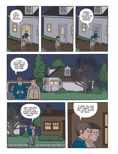
A panel from The Three Paradoxes

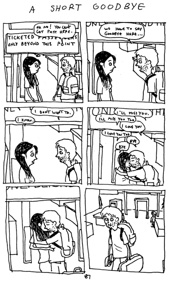
An excerpt from Clumsy by Jeffrey Brown
Green similarly excelled in his presentation of Jeffrey Brown’s various sketchbooks, published works, and stories. Two tables in the middle of the room displayed each book open to a narrative, interesting sketch, or script for a comic. Usually, I have a problem with displaying books as art objects because I find it frustrating to only see one page out of an entire book. However, Brown’s short vignettes were so amusing and well paired that I was not bothered. The one-page stories moved from childhood to Brown’s pimpled teenage years to his sometimes-awkward adult life. Although only a random sampling of his work, these stories presented a seemingly complete narrative.
One of the most important aspects of Green’s presentation was that he revealed the process of making comics. He showed this by combining Hornschemeier’s original pages and finished comic. With Brown’s work, he paired a rough sketch and notes of a cartoon with the final version. Green created an exhibit that not only presented comics in a unique way, but provided an intimate look into the creator’s mind as well.
(I didn’t forget about Carré and Nilsen. They are, out of the four, the two artists that draw the most beautiful and detailled comics. I plan on discussing their mind-blowingly fascinating art in my next post.)
Thanks, Claire
ReplyDelete